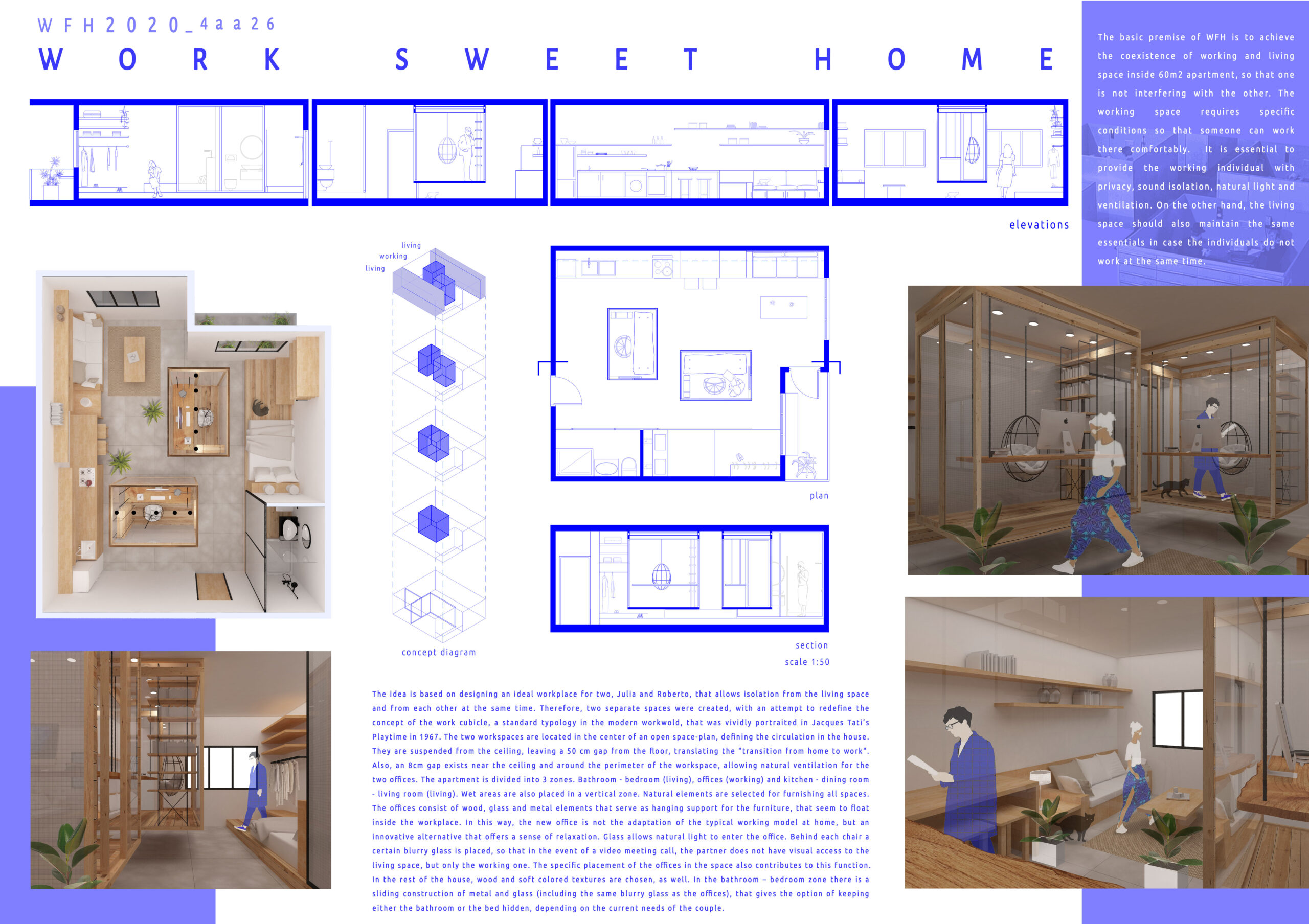
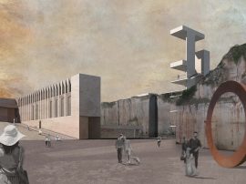
The basic premise of WFH is to achieve the coexistence of working and living space inside 60m2 apartment, so that one is not interfering with the other. The working space requires specific conditions so that someone can work there comfortably. It is essential to provide the working individual with privacy, sound isolation, natural light and ventilation. On the other hand, the living space should also maintain the same essentials in case the individuals do not work at the same time.
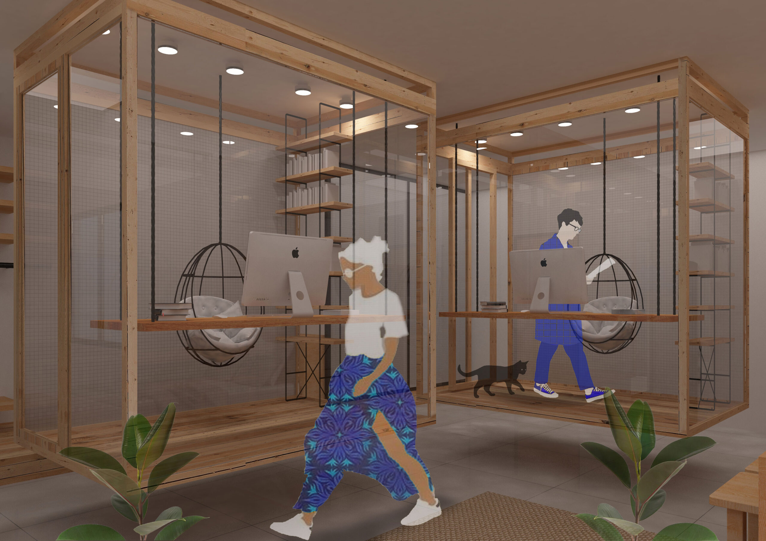
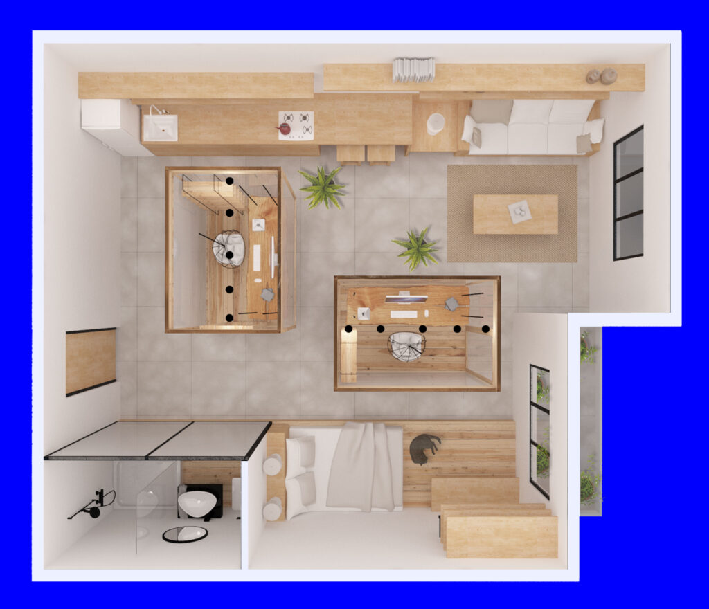
The idea is based on designing an ideal workplace for two, Julia and Roberto, that allows isolation from the living space and from each other at the same time. Therefore, two separate spaces were created, with an attempt to redefine the concept of the work cubicle, a standard typology in the modern workwold, that was vividly portraited in Jacques Tati’s Playtime in 1967. The two workspaces are located in the center of an open space-plan, defining the circulation in the house. They are suspended from the ceiling, leaving a 50 cm gap from the floor, translating the "transition from home to work". Also, an 8cm gap exists near the ceiling and around the perimeter of the workspace, allowing natural ventilation for the two offices. The apartment is divided into 3 zones. Bathroom - bedroom (living), offices (working) and kitchen - dining room - living room (living). Wet areas are also placed in a vertical zone. Natural elements are selected for furnishing all spaces. The offices consist of wood, glass and metal elements that serve as hanging support for the furniture, that seem to float inside the workplace. In this way, the new office is not the adaptation of the typical working model at home, but an innovative alternative that offers a sense of relaxation.
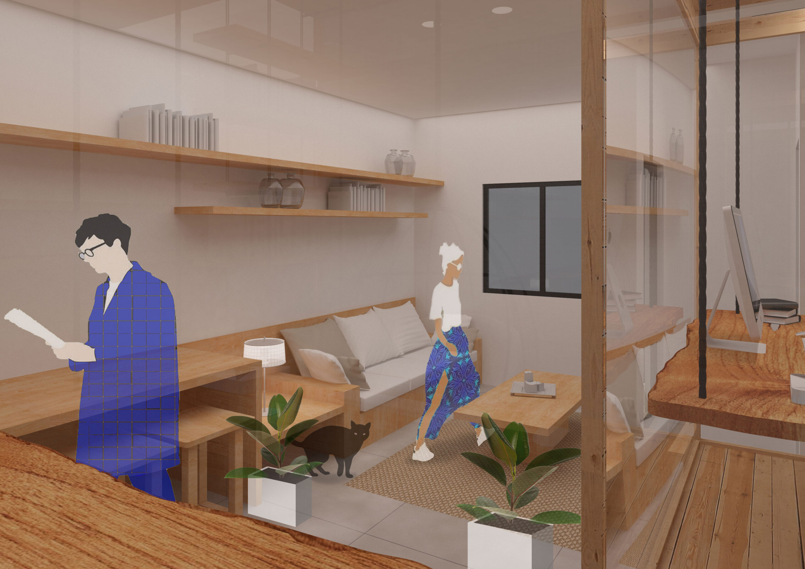
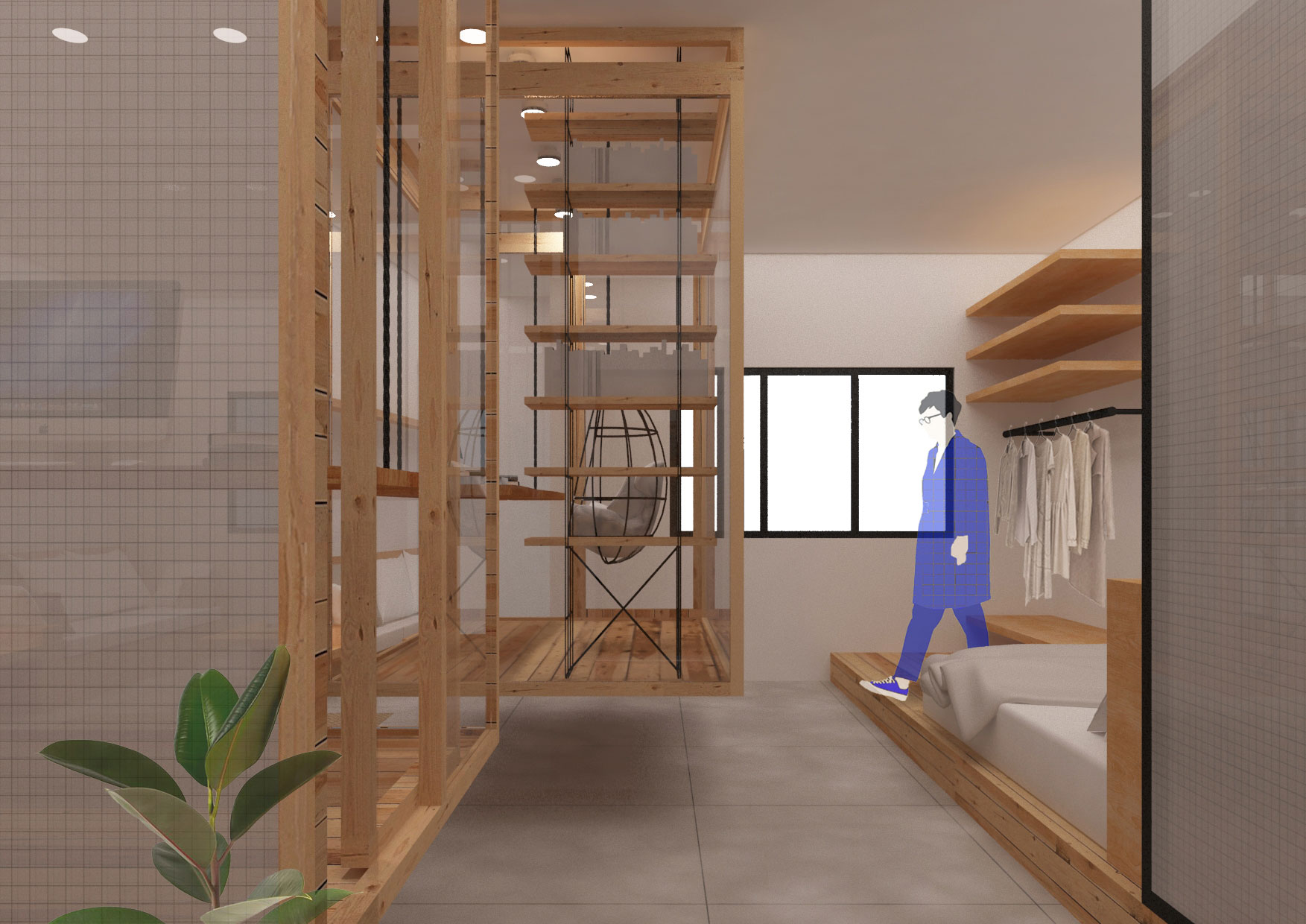
Glass allows natural light to enter the office. Behind each chair a certain blurry glass is placed, so that in the event of a video meeting call, the partner does not have visual access to the living space, but only the working one. The specific placement of the offices in the space also contributes to this function. In the rest of the house, wood and soft colored textures are chosen, as well. In the bathroom – bedroom zone there is a sliding construction of metal and glass (including the same blurry glass as the offices), that gives the option of keeping either the bathroom or the bed hidden, depending on the current needs of the couple.
The Board:
